
先日、Windows のタスクバーに小さいスタートメニューみたいなサブメニューを追加するランチャーアプリケーションを WPF で作りまして。
で、作っている最中に、そのものズバリの日本語情報がネット検索で「簡単に」見つからなかったケースがいくつかありましたので、それらを4~5回に渡って記事化して放流しておこうと思います。
さて、今回はマウスオーバー時にボタンの色を変更する方法についてです。
読み込み中です。少々お待ち下さい
まえおき
HTML+CSS で hover 擬似クラスを使って良くやるように、ボタンの上にマウスポインタが乗った時に、文字色や背景色を変更してみましょう。
WPF のボタンは、特に何もしなくてもマウスオーバー時にデフォルトでボーダーと背景色が青っぽく変わりますが、全体の配色的に違う色にしたい場合もあるかと思います。
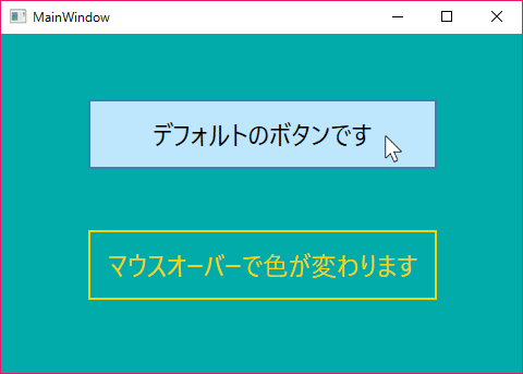
つまり、今回は以下のようなことをしてみます。
- 下で紹介しているコードを実行すると、こんな感じ
- WPF のボタンは、マウスオーバー時にデフォルトで背景色とボーダーが青っぽく変わります
- 下段のボタンをカスタマイズして、こんな風に白っぽく文字色と背景色が変わるように変更してみましょう

なんとなく「こんな感じでいいんじゃねーの?」みたいに書くと、何故か上手く動作しないことがありますので、まずはそちらのパターンから見ていきましょう。
サンプルコード(駄目なパターン)
以下のコードは、Visual Studio (2015) の「ファイル」メニュー>「新規作成」>「WPF アプリケーション」から「WpfHoverButton」という名前で新しいプロジェクトを作成し、自動的に生成される MainWindow に上書きすれば、そのまま動作します。
今回は「MainWindow.xaml.cs」の方は一切いじっていないので、「MainWindow.xaml」だけ貼り付けておきます(青字が、こちらで追加・変更した部分になります)。
MainWindow.xaml
<Window x:Class="WpfHoverButton.MainWindow"
        xmlns="http://schemas.microsoft.com/winfx/2006/xaml/presentation"
        xmlns:x="http://schemas.microsoft.com/winfx/2006/xaml"
        xmlns:d="http://schemas.microsoft.com/expression/blend/2008"
        xmlns:mc="http://schemas.openxmlformats.org/markup-compatibility/2006"
        xmlns:local="clr-namespace:WpfHoverButton"
        mc:Ignorable="d"
        Title="MainWindow" Height="350" Width="494" Background="#FF00ABA9">
    <Window.Resources>
        <!-- 通常時のボタンの色 -->
        <SolidColorBrush x:Key="NormalButtonBrush" Color="#F7D10C"/>
        <!-- 通常時のボタンの背景色 -->
        <SolidColorBrush x:Key="NormalBackgroundBrush" Color="Transparent"/>
        <!-- マウスオーバー時のボタンの色 -->
        <SolidColorBrush x:Key="HoverButtonBrush" Color="#ffffff"/>
        <!-- マウスオーバー時のボタンの背景色 -->
        <SolidColorBrush x:Key="HoverBackgroundBrush" Color="#66ffffff"/>
        <!-- カスタムボタンのスタイル -->
        <Style x:Key="HoverButtonStyle" TargetType="{x:Type Button}">
            <Setter Property="Foreground" Value="{StaticResource NormalButtonBrush}"/>
            <Setter Property="Background" Value="{StaticResource NormalBackgroundBrush}"/>
            <Setter Property="BorderBrush" Value="{StaticResource NormalButtonBrush}"/>
            <Setter Property="BorderThickness" Value="2" />
            <Style.Triggers>
                <Trigger Property="IsMouseOver" Value="True">
                    <Setter Property="Foreground" Value="{StaticResource HoverButtonBrush}"/>
                    <Setter Property="Background" Value="{StaticResource HoverBackgroundBrush}"/>
                    <Setter Property="BorderBrush" Value="{StaticResource HoverButtonBrush}"/>
                </Trigger>
            </Style.Triggers>
        </Style>
    </Window.Resources>
    <Grid>
        <Button x:Name="button1" Content="デフォルトのボタンです" HorizontalAlignment="Left" Margin="80,60,0,0" VerticalAlignment="Top" Width="320" Height="64" FontSize="24" BorderThickness="2"/>
        <Button x:Name="button" Style="{StaticResource HoverButtonStyle}" Content="マウスオーバーで色が変わります" HorizontalAlignment="Left" Margin="80,180,0,0" VerticalAlignment="Top" Width="320" Height="64" FontSize="24"/>
    </Grid>
</Window>
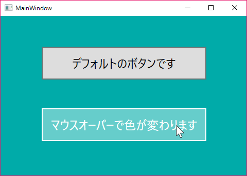
一見、「これでいいんじゃね?」と思えるのですが、いざ実行してみると、以下のように文字色こそ白く変わるものの、ボーターと背景色はデフォルトと同じ青っぽい色のまま変わっていません。
- 文字色こそ変わるが、ボーターと背景色はデフォルトの青っぽいまま、想定通りに反映しない
サンプルコード(修正版)
さて、このような場合は ControlTemplate を使ってみましょう。
赤字が、上から変更した部分になります。
MainWindow.xaml
<Window x:Class="WpfHoverButton.MainWindow"
        xmlns="http://schemas.microsoft.com/winfx/2006/xaml/presentation"
        xmlns:x="http://schemas.microsoft.com/winfx/2006/xaml"
        xmlns:d="http://schemas.microsoft.com/expression/blend/2008"
        xmlns:mc="http://schemas.openxmlformats.org/markup-compatibility/2006"
        xmlns:local="clr-namespace:WpfHoverButton"
        mc:Ignorable="d"
        Title="MainWindow" Height="350" Width="494" Background="#FF00ABA9">
    <Window.Resources>
        <!-- 通常時のボタンの色 -->
        <SolidColorBrush x:Key="NormalButtonBrush" Color="#F7D10C"/>
        <!-- 通常時のボタンの背景色 -->
        <SolidColorBrush x:Key="NormalBackgroundBrush" Color="Transparent"/>
        <!-- マウスオーバー時のボタンの色 -->
        <SolidColorBrush x:Key="HoverButtonBrush" Color="#ffffff"/>
        <!-- マウスオーバー時のボタンの背景色 -->
        <SolidColorBrush x:Key="HoverBackgroundBrush" Color="#66ffffff"/>
        <!-- カスタムボタンのスタイル -->
        <Style x:Key="HoverButtonStyle" TargetType="{x:Type Button}">
            <Setter Property="Foreground" Value="{StaticResource NormalButtonBrush}"/>
            <Setter Property="Template">
                <Setter.Value>
                    <ControlTemplate TargetType="{x:Type Button}">
                        <Border Name="HoverButtonBorder" BorderThickness="2" BorderBrush="{StaticResource NormalButtonBrush}" Background="{StaticResource NormalBackgroundBrush}">
                            <ContentPresenter HorizontalAlignment="Center" VerticalAlignment="Center"/>
                        </Border>
                        <ControlTemplate.Triggers>
                            <!-- マウスオーバー -->
                            <Trigger Property="IsMouseOver" Value="True">
                                <Setter TargetName="HoverButtonBorder" Property="BorderBrush" Value="{StaticResource HoverButtonBrush}" />
                                <Setter TargetName="HoverButtonBorder" Property="Background" Value="{StaticResource HoverBackgroundBrush}" />
                                <Setter Property="Foreground" Value="{StaticResource HoverButtonBrush}"/>
                            </Trigger>
                            <!-- ボタンを押した時に、背景色を透過 -->
                            <Trigger Property="IsPressed" Value="True">
                                <Setter TargetName="HoverButtonBorder" Property="Background" Value="{StaticResource NormalBackgroundBrush}" />
                            </Trigger>
                        </ControlTemplate.Triggers>
                    </ControlTemplate>
                </Setter.Value>
            </Setter>
        </Style>
    </Window.Resources>
    <Grid>
        <Button x:Name="button1" Content="デフォルトのボタンです" HorizontalAlignment="Left" Margin="80,60,0,0" VerticalAlignment="Top" Width="320" Height="64" FontSize="24" BorderThickness="2"/>
        <Button x:Name="button" Style="{StaticResource HoverButtonStyle}" Content="マウスオーバーで色が変わります" HorizontalAlignment="Left" Margin="80,180,0,0" VerticalAlignment="Top" Width="320" Height="64" FontSize="24"/>
    </Grid>
</Window>
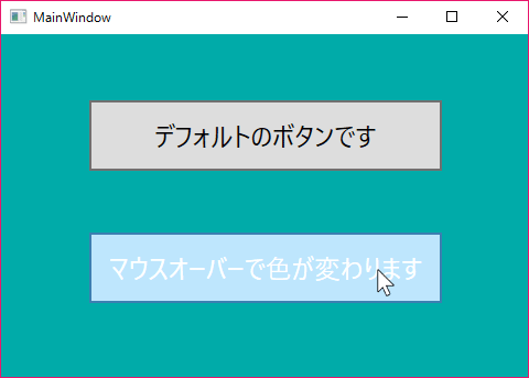
このように書くと、下段のボタンにマウスポインタを乗せた時に、以下のようにボーダーと背景色が想定通りの色に変更されます。
- 想定通り、ボーターと背景色が白っぽく変わっている
もう少し良い書き方がある気もするのですが、とりあえずこんな感じで。
うーん......
正直なところ、修正前の書き方でちゃんと動作しないと、ホントはいけないんじゃないかと思います。
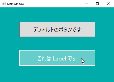
だって、例えばボタンじゃなくてラベルなら、前者と同様のこんな書き方でも、想定通りに色が変わりますからね。
MainWindow.xaml
<Window x:Class="WpfHoverButton.MainWindow"
        xmlns="http://schemas.microsoft.com/winfx/2006/xaml/presentation"
        xmlns:x="http://schemas.microsoft.com/winfx/2006/xaml"
        xmlns:d="http://schemas.microsoft.com/expression/blend/2008"
        xmlns:mc="http://schemas.openxmlformats.org/markup-compatibility/2006"
        xmlns:local="clr-namespace:WpfHoverButton"
        mc:Ignorable="d"
        Title="MainWindow" Height="350" Width="494" Background="#FF00ABA9">
    <Window.Resources>
        <!-- 通常時のボタンの色 -->
        <SolidColorBrush x:Key="NormalButtonBrush" Color="#F7D10C"/>
        <!-- 通常時のボタンの背景色 -->
        <SolidColorBrush x:Key="NormalBackgroundBrush" Color="Transparent"/>
        <!-- マウスオーバー時のボタンの色 -->
        <SolidColorBrush x:Key="HoverButtonBrush" Color="#ffffff"/>
        <!-- マウスオーバー時のボタンの背景色 -->
        <SolidColorBrush x:Key="HoverBackgroundBrush" Color="#66ffffff"/>
        <!-- カスタムラベルのスタイル -->
        <Style x:Key="HoverLabelStyle" TargetType="{x:Type Label}">
            <Setter Property="Foreground" Value="{StaticResource NormalButtonBrush}"/>
            <Setter Property="Background" Value="{StaticResource NormalBackgroundBrush}"/>
            <Setter Property="BorderBrush" Value="{StaticResource NormalButtonBrush}"/>
            <Setter Property="BorderThickness" Value="2" />
            <Style.Triggers>
                <Trigger Property="IsMouseOver" Value="True">
                    <Setter Property="Foreground" Value="{StaticResource HoverButtonBrush}"/>
                    <Setter Property="Background" Value="{StaticResource HoverBackgroundBrush}"/>
                    <Setter Property="BorderBrush" Value="{StaticResource HoverButtonBrush}"/>
                </Trigger>
            </Style.Triggers>
        </Style>
    </Window.Resources>
    <Grid>
        <Button x:Name="button1" Content="デフォルトのボタンです" HorizontalAlignment="Left" Margin="80,60,0,0" VerticalAlignment="Top" Width="320" Height="64" FontSize="24" BorderThickness="2"/>
        <Label x:Name="label" Style="{StaticResource HoverLabelStyle}"  Content="これは Label です" HorizontalAlignment="Left" Margin="80,180,0,0" VerticalAlignment="Top" HorizontalContentAlignment="Center" VerticalContentAlignment="Center" Width="320" Height="64" FontSize="24"/>
    </Grid>
</Window>
- 想定通りに動作します
なんでボタンの場合は、デフォルトの方が強いのさ(笑)
こういうところが、元記事の締めで「WPF はクセが強すぎる」と評さざるを得なかった理由の一端です。
おわりに
さて、WPF について、まだ何か書こうと思っていたことがあったような気もするのですが、覚え書きを紛失してしまったので、続くかどうかは分かりません。
思い出したら、またお会いしましょう。
 ステレオの左右等、チャンネル毎のボリュームをお手軽に調節できるWindowsアプリを作ってみました
 Windowsタスクバーにアイコンをまとめて登録できるメニューアプリを作ってみました
 数ヶ月越しで我が家にお越しいただいた Alexa と戯れる(Amazon Echo Dot の感想)
 コルタナさん、もう少し静かに喋っていただけますか(アプリ毎にボリュームを設定する方法)
 iPhone X で手軽にホーム画面の1枚目に戻ったりアプリの削除画面を完了する方法
 iPhone X の Face ID が全然認識しないと思ったら、まるきり自分のせいだった話
 macOS High Sierra にアップグレードしたら、CocoaPods が動かなくなった
 Swift 4 で substring 的にインデックスを指定して部分文字列を取り出す方法
 iOS 11以降は、Apple IDの2ステップ確認には対応せず、2ファクタ認証に一本化される模様